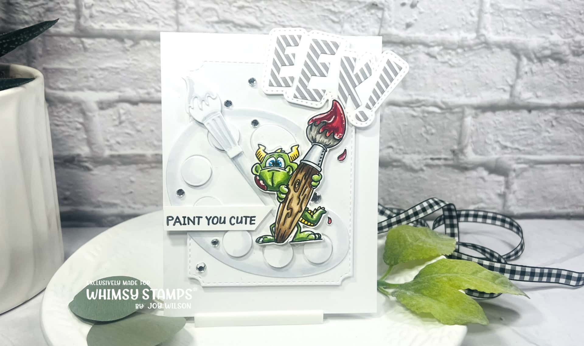
Hello friends. I have been attending quite a few trade shows this year and have noticed that the maximalist style is coming back You might be asking what that is. It is a style defined by many layers, textures and bold colors. When I think of the clean and simple style I see a lot of white space and one focal point. I don’t think there’s a true definition of clean and simple as I have seen a lot of interpretations, but that’s how I define it. If you have been around for a while you know that I’m a more is more kind of girl who loves layers, textures and dimension, but I am drawn to the CAS. Let’s see if I can bring the two styles together with my latest Whimsy Stamps project.

I used a lot of white space to meet the criteria of CAS, but used vibrant colors for the Dudley Art stamped image. I of course used Copics, because that’s what I love! I chose the yellow greens and reds because they complimentary colors or opposite on the color wheel to really make him pop meeting one criteria of Maximalism. I love all the layers I used on this card as well, but maintained a lot of white space. My first layer was created by popping up the largest of the Notched Rectangles onto the card base. Next I cut the Paint and Palette die from heavy cardstock and colored it with cool grey Copics. For added dimension I popped the “paint” up from the palette. In addition to Dudley I cut the Eek! Word and Shadow die for another focal area. You can find all of the details more thoroughly explained in the video below!
You can find more Whimsy Inspiration at the following links:
SHOP:
Youtube
Facebook
Instagram
Pinterest
Just a small disclaimer! All items used in all of my projects are (or have been) purchased with my own funds, but this does not include design team items that I have received or otherwise stated.

You can connect with me here:
IG @joywilsonink
Pinterest
Youtube
Until next time keep crafting!!!

