
There’s something incredibly powerful about a handmade card that tells a story—and today’s design does exactly that. Using the Back the Blue stamps, Some Gave All stamp/die bundle, and the Casted Net stencil, this card is a heartfelt tribute filled with texture, movement, and meaning.
✨ Strong Visual Storytelling
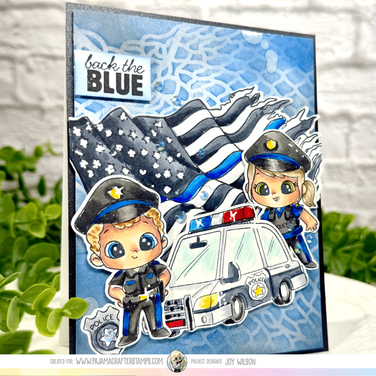
The first thing that draws your eye is the bold thin blue line American flag, (Some Gave All Stamp/Die Bundle) waving in the background. This isn’t just a backdrop—it’s the emotional anchor of the card. By pairing the Casted Net stencil with Distress Oxide ink blending, the background creates a soft yet textured sky that adds depth without overpowering the focal elements.
The subtle variation in blues gives the illusion of atmosphere and movement, almost like the flag is blowing in the wind behind the scene.

🎨 Copic Coloring that Brings Characters to Life
The adorable officers from the Back the Blue stamp set are colored beautifully with Copic markers, and this is where the card truly comes alive.
- Soft skin tones with warm shading create a friendly, approachable feel
- The uniforms feature rich blacks and cool grays with pops of vibrant blue
- Highlights and contrast add dimension without losing that signature “cute” PCS style
These characters aren’t just stamped images—they feel like personalities, which makes the card even more impactful.
🚓 Layering & Dimension for Maximum Impact
Let’s talk about composition—because this card nails it.
- The police car is grounded in the foreground, creating a strong base
- The officers are popped up for dimension, adding movement and interaction
- The layered flag behind everything ties the scene together
This multi-level design keeps your eye moving across the card, making it visually engaging from every angle.
💙 Thoughtful Details that Elevate the Design
It’s the little things that take this card from beautiful to unforgettable:
- Sparkling embellishments add just the right amount of shine
- The “Back the Blue” sentiment is clean, bold, and perfectly placed
- The monochromatic blue palette keeps the theme cohesive and powerful
Every element works together to support the message—honor, gratitude, and support.
🛠 Techniques Used
If you’re looking to recreate or be inspired by this design, here are the key techniques:
- Distress Oxide Ink Blending for a soft, layered stencil background
- Copic Coloring for vibrant, dimensional characters
- Die Cutting & Layering for a dynamic scene
- Pop Dots / Foam Adhesive to build depth and interest
💡 Design Takeaway
This card is a perfect reminder that you can combine cute imagery with powerful themes. The balance between playful characters and a meaningful message is what makes this design stand out.
Thanks for using my affiliate links! You all are the BEST! Using an affiliate link in this post above or down below costs you nothing, but it gives me a teeny percentage of your sale to buy more crafty goodies to continue to share card tutorials with YOU! So, thank YOU! Xx, Joy

Whether you’re creating for appreciation, encouragement, or honoring service, this combination of stamps and techniques delivers a card that truly speaks from the heart.
Joy
Leave a Reply